CSS Grid Layout: The Future is Now
Over the history of the web, there have been a number of different ways in which we laid out content. From the earliest days when we had plain ol’ markup, through the HTML tables and spacer gif era, past the float and clearfixes, and up to today where we can use flexbox and get support for almost 98% of the users of the web.
While each of these methods had their merits and were seen as advancements in their day, they were all best suited for only certain use cases and not overall page layouts.
So what’s a web developer to do?
Enter CSS Grid Layout, a 2-dimensional layout system for CSS that allows for more complex layouts while using simpler markup. It’s the future of how we lay out our web pages, so we should all probably all get a bit more familiar with it.
To give you an idea of how CSS Grid Layout can simplify the code we write and shorten development time, let’s look at a simple example.
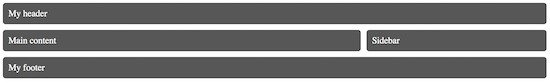
Here is a basic page layout we want to create:
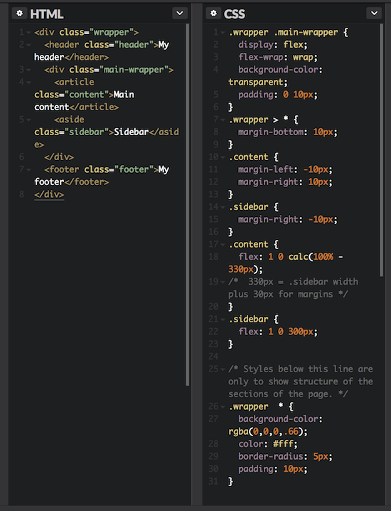
Without grid layout, the HTML and CSS we need looks something like this:
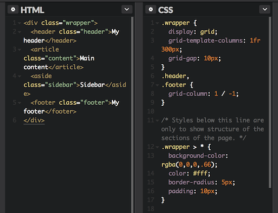
Leveraging grid layout to create the same result reduces both our HTML and CSS weight:
There are some obvious questions. How safe is it to use? Well, the current versions of all major browsers support CSS Grid Layout. You may even be surprised to know that there is support for it all the way back to IE10.
There are some caveats, though.
IE, being the original implementer of the spec, doesn’t support all of the current specifications, as it has matured over the last couple of years. It also requires -ms prefixing of any of the rules that it does support, but that’s not really all that big of a deal.
Note that we’re talking about current versions of the major browsers, which includes just under two-thirds of web users. What about the other third? Thankfully, we have the ability to check for support of grid layout through feature queries. Similar to how media queries check for viewport size or media type, feature queries check if the browser supports a CSS property using an @supports rule. This allows us to accommodate older browsers through the use of some of those other older methodologies.
So, now that we know we can use grid layout, when should we use it? And why should we it? The answer is as with most things: it depends.
CSS Grid Layout can be used for nearly any page layout that has been built through traditional methods, but is best when used to lay out content in two dimensions, rows AND columns. Flexbox, on the other hand is best used for laying out content in a single dimension, either a row OR a column. (This is not to say that flexbox content can’t or shouldn’t wrap.)
One of the most powerful tools within the Grid toolbox is the ability to arbitrarily order the content. Please use care and consideration when doing this as it can have a significant impact on the accessibility of your content, particularly for keyboard-only and screen reader users.
There will be arguments that it takes too long to learn and implement a layout with Grid, plus having to create fallback layouts. I know, I’ve been making them myself. But Grid is a powerful tool that can open doors to layouts and pages we’ve not yet been able to build effectively without wonkiness. The sooner we learn what we can do with the tools at our disposal, the sooner we’ll be able to master them and push boundaries.
If I’ve managed to convince you that now is the time to dig in, check out the work of Jen Simmons and her lab, as well as Rachel Andrew. They’re producing great content and tutorials on CSS Grid Layout.