Notes from the 2018 Summer Interns
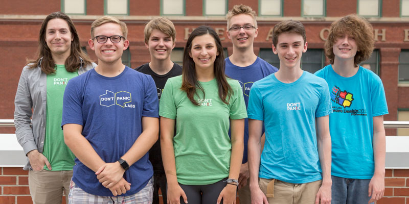
Hello! We are the seven 2018 summer interns of Don’t Panic Labs (Matt Kachek, Jack Rowen, Luke Farritor, Lexie Karkazis, Taylor Bernt, Noah Costello, and Lee Hayes). In this blog post, we’ll share about the projects that we worked on (MyLNK, TeamMates, and BenefitEd) as well as share some of the experiences we had outside of programming.
MyLNK
MyLNK is a project that puts information from local organizations together and creates an easily accessible resource for all the services available here in Lincoln.
The information within MyLNK can be searched and shared so people who are experiencing a crisis can easily get the information they need. The idea for this app came from Bryan Seck who noticed that the current resources weren’t very helpful for many of the families that he worked with. Currently, information about services that our community provides are shared through large resource handbooks or unsearchable PDFs. People were struggling to use these because they were so big that it was difficult to find the information that they needed, and the information was often out of date.
Our goals for MyLNK was to make a resource that could be used without internet (like a book or PDF), would be free to access, and could be easily updated so information is as accurate as possible.
MyLNK App
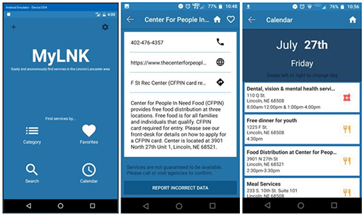
The MyLNK mobile app was the first part of the project. It is a free app available for iOS and Android devices. The app is split into four main sections:
- Categories view, which presents programs sorted by categories and subcategories. There are a variety of categories, such as food, education, employment, etc. These programs are further separated into subcategories, allowing data to be easily presented in a digestible manner.
- Favorites view, so you can “bookmark” programs you may want to view again.
- Search view, where you can easily find programs.
- Calendar view, which will show you all the programs available on a given day. For example, one could view all the food available on a Thursday.
Since the launch of the app in early 2018, it has been downloaded 4,500 times with over 1,000 monthly active users. Based on the feedback we’ve received, we have added a number of fixes and features, such as the ability to request a new program be added to the database.
In the future, we plan to translate the app into different languages, as well as expand our app into different parts of Nebraska.
MyLNK Website
Ever since the inception of the MyLNK app, we’ve been wanting to create a website that would allow resources to be seen by more people, but the priority to create the app and admin site didn’t leave us with enough time. It was only in early July 2018 that we finally got a chance to flesh out the MyLNK Website. Despite the short timeframe, the website has come along great so far and we’re proud of what we’ve been able to make.
Our goal with the website was to give people unable to use the mobile app easy access to use and share MyLNK resources. Because of this, we focused on a design for the website that would be easy to navigate for anyone, from the most tech illiterate people to the most computer savvy, keeping in mind that some people who use our website may not be native English speakers. We spent a lot of time creating our own mockups of how the website could look. The final product was the result of brainstorming by the intern dev team based on the look of the mobile app combined with the work of Sophie Lorenz, one of the Interaction Designers at Don’t Panic Labs.
The website contains the majority of the functionality present on the mobile app such as being able to navigate programs by either a category view or by a smart search, the ability to store favorite programs and organizations, and an expanded calendar view that allows viewing of events by month or week as opposed to the app’s calendar (which was limited to a day-by-day view). We are also working on a new PDF generation tool, which will allow users to generate a customizable document containing selected MyLNK resources in a printable format.
Recently, we’ve been in talks with representatives of Lincoln Public Schools about how they could start using MyLNK both in the classroom and more. Previously, teachers and counselors had been using the MyLNK app to help students find resources. However, with the creation of the MyLNK website, LPS has allowed us to put a shortcut to the MyLNK website onto the desktop of every LPS Chromebook. This allows easy and free access to the MyLNK website for every family in the LPS system. This is a major milestone for MyLNK. We are ecstatic about being able to more easily reach the people for which the app and website were designed.
TeamMates
The TeamMates admin site was originally created as a Design Studio project in the Raikes School at UNL. After the project was finished, Don’t Panic Labs took over the responsibility of maintaining the site. After a while, the site became too cumbersome to make timely changes. About a year ago, the decision was made to recreate the TeamMates backend.
While recreating the TeamMates admin site, our focus has been to recreate functionality with more responsive features while adding more modern styling. Thankfully, the styling was provided to us in mockups created by Don’t Panic Labs’s wonderful Interaction Designer Sophie Lorenz.
Let’s look at some features!
Disable a Chapter
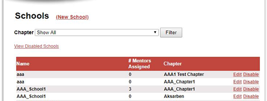
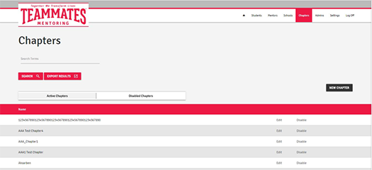
The images above show the old TeamMates schools page and the new Chapters page. To disable a chapter, an admin would have needed to go to the Schools page, not the Chapter page. This is an example of the odd design of the old site that caused maintenance headaches for engineers. We changed the location of the Disable Chapter button in the new site to more accurately match the functionality of chapters within the software. Now, when an engineer works on chapters within the TeamMates site, they can find the code for chapters in one place rather than spread out across multiple files.
Filtering
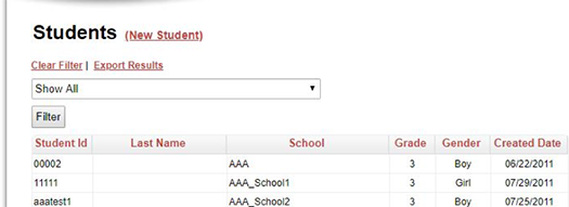
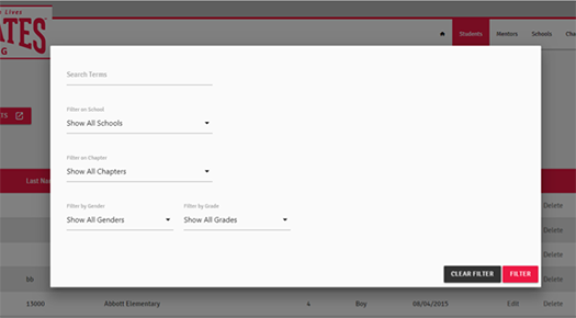
Above are the old and new student pages. When an admin would have wanted to filter students on the old site, they could only filter by schools. On the new site, a window pops up with filter dropdowns for schools, chapters, genders, grades, and even a search bar to find a specific student. More filtering options are provided for the admin to filter on the new site.


The styling of Excel files has been heavily modified. With CsvHelper, a programming library for reading and writing CSV files, we were able to create the more stylized, user-friendly Excel document.
While adding more styling throughout the new TeamMates site, we also maintained a long-term perspective by writing code that won’t become too complex after a few years, to use more consistent software practices, and to create a more user-friendly and developer-friendly web application. We approached constructing each feature on the new site by decoupling a lot of the old functionality to allow less time-intensive changes to be made in the future.
BenefitEd
BenefitEd is a tool that enables employers to easily assist their employees with student loan repayment and education savings. Two of us joined the project alongside the full-time development team to add some extra development velocity ahead of an upcoming release. A unique part of this project was when we met with our clients every day at our standups and getting requirements and feedback directly for our tasks.
Our focus on the project was mostly on changes to improve the user experience of the site. It was important that both employees and employers be able to enter their information as easily as possible and feel confident that the system was doing what they expected. After all, the site only functions well if lots of people are enrolled in the program.
For employees, we wanted to make the enrollment process descriptive and responsive without overloading them with too much information. We had to strike a balance on each screen. Sometimes we would need to change the wording of instructions based on their workflow, and other times we would need to fetch and display a value they had entered a few steps before. When it came to monetary inputs, we had to set it up to convert between percentages and dollars across the entire signup process so that users would be confident that the amount they were entering was accurate.
The employer side had similar needs. Employers manage their company’s specific programs and upload information about each employee that they enroll. We worked to provide extra feedback to employers when they upload data to the system, so they can feel confident that everything is right. If anything is out of place, we also made it easy for them to identify and fix the problem.
Other Experiences
Early in the summer, our internship coordinator Lori McCarthy advised the intern gang to attend MyTern, a series of weekly events put on by the Lincoln Partnership for Economic Development. At MyTern events, we were encouraged to share our experiences as interns outside of the office in a relaxing environment. There were four events: a mixer to start off the series, a yard games tournament, an idea pitch competition, and a wrap-up celebration.
At these events, professionals from the community would attend to share the wealth of their experiences with us interns so we could learn from and connect with them. While at these events, we would see friends from UNL and share our projects. These conversations wound up creating a wonderful dialogue, full of the work we are doing as college students already affecting the world. A startup could have been born from these conversations. The MyTern events created an encouraging environment to discover both the opportunities we can’t see and those which are waiting for us.
We were exposed to many learning opportunities inside the office as well. Beyond our daily coding work, Don’t Panic Labs allowed us to broaden our knowledge through workshops, presentations, and meetings with full-time employees.
One of these events was a summer-long, software architecture workshop. This workshop is something they do for their full-time employees, and we were fortunate enough to sit in and participate right alongside them. The workshop consisted of bi-weekly meetings discussing how to architect a system from a backlog of requirements up through interface and data contract design. In between meetings, there were practice assignments where we could test ourselves by trying our own implementation and receiving feedback on how we did.
This was a beneficial and unique experience for us. Often, interns aren’t involved in architecture conversations. At most we might be allowed to fit a new workflow into an existing architecture. With this workshop though, we were able to dive into the decision making behind the architecture. This was helpful with our day to day work, but it’s also something that we can use beyond just this internship. We can incorporate what we learned into school projects, or even go to a new workplace and be prepared to participate in system architecture discussions right away.
Another event that Don’t Panic Labs hosted was their “Vogon Poetry” series. These were events where members of the company present some knowledge they have that might not come up in their everyday work. This blog post itself is actually based off of a presentation we gave at the end of our internships to show off the intern experience.
These Vogon Poetries were a great chance for us to learn from other members of the company and to get some broader knowledge than just what we were learning on our projects. There were some technical talks such as using AWS Lambda and another about the Selenium testing environment. We also got to hear some less technical talks though. One of the Interaction Designer gave an inspiring talk on life hacks and some of his creative pursuits.
Don’t Panic Labs also supported an event organized by us. We set up some meetings to talk with the people who work in these roles every day. We talked with the company CTO, two business developers, and a UX designer. They told us about what their jobs entail and how they ended up in those roles. These talks broadened our perspectives on what kinds of jobs are out there and made us consider whether we’d want to pursue them in the future.
Fun Stuff
The intern experience wasn’t all working and learning. We made some time to do some fun activities and grow closer as a group. Don’t Panic Labs has a ping pong table in their office; we made good use of it. We played almost every day (sometimes twice a day) and it was a great competitive outlet for us. During our work, we were always supportive of each other, and everyone was willing to help each other out, but sometimes you just need to let loose and get competitive.
When it came to socializing, lunch was our time to take a pause from work and talk about the other parts of our lives. Most days, we’d grab a table in the common area, but sometimes we’d go out to eat. Our great location in the Lincoln Haymarket gave us a lot of variety, but our favorite type of food to get was definitely sushi. Of course, we’re located right next to The Mill and Crescent Moon too, so we were always up for grabbing coffee in the morning or some afternoon tea.
Whether we constructed the MyLNK site, rebuilt the TeamMates site, or aided the BenefitEd project, each of us interns had the opportunity to be part of a great team. Interning at Don’t Panic Labs provided us projects to “own,” events to attend, insightful opportunities, and a lot of fun!
