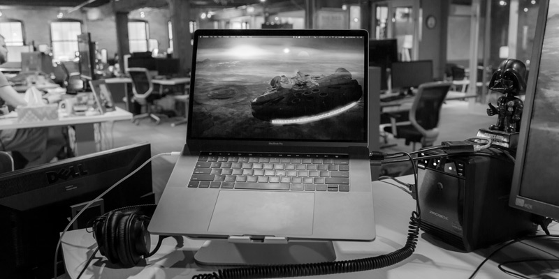
How I Ignored the Haters and Bought a 2016 MacBook Pro
In the past, we have had engineers share about their hardware of choice. From Steve’s developer laptop, to Curtis’s MacBook Pro, and Matt’s Microsoft Surface Pro, we’ve read about how each machine suited the respective users’ workflows and preferences.
But now it’s time to hear from a non-engineer. Me.
While I’m a technical writer by trade, communications in general is where I thrive. If you’ve watched one of our videos, seen one of our photos, read our blog, and kept up with us on social media, I most likely shot, edited, reviewed, wrote, or posted it.
How my role at Don’t Panic Labs differs from everyone else is reflected in my different hardware needs.
For the past six years, I’ve been through a couple Dell desktop tower configurations, with a fair amount of RAM and a beefy graphics card to accelerate video and photo editing. For some time, I had been wanting to take advantage of our hardware purchase program, but didn’t feel satisfied with what I was finding. Sure, there were some “workstation-level” notebooks that could probably handle what I needed, but not knowing anyone who had actually used one of these machines made me hesitant to take the plunge. Added to that, I’m a Mac guy.
So, I waited for Apple to create something I deemed worthy.
And then October 2016 rolled around and Apple unveiled their latest revision to the MacBook Pro line. I could wait no longer.
I know there’s a fair amount of hate for Apple and their design choices. I’m not going to dispute that. Sometimes I even disagree with their decisions. The purpose of this post isn’t to change minds, defend Apple’s designs, or disparage anyone who thinks Apple has lost their way (or if they ever on the right track to begin with).
Instead, I will show how I’m using my new machine, how I incorporated it into my workflows, and worked around the challenges of having fewer ports, decreased internal storage, and whole new port format.
Specifications
I knew the base configuration wasn’t going to cut it. I run a good portion of the Adobe CC suite (from video to print applications), so skimping would not be wise. While the machine I purchased is not a maxed-out system, I think I landed a good balance between performance and not breaking the bank.
Here’s my configuration:
- 2.6 GHz Core i7
- 16 GB RAM
- 512 GB internal SSD
- Radeon Pro 460 with 4 GB RAM
Storage
Since I do a fair amount of video production and photography, no amount of internal storage would suffice. With that in mind, having some sort of external storage device was always in the picture. Added to that, I don’t like editing video on my system drives (for performance and longevity considerations).
Our IT department had a 4-bay drive enclosure laying around, so I snagged it and put it into service to octuple my storage.
USB-C (I don’t hate it THAT much)
What may be the most controversial change with this MacBook Pro iteration is Apple’s decision to include only USB-C ports for both data and power. This did away with the MagSafe power adapters we had loved for years and made it pain in the rear for anyone who plugs in more than just headphones. I’ll be honest, it makes for an ugly mess on my desk due to the adapters I need.
I’m a planner. Before I purchased the MacBook Pro I probably spent more hours than I’d like to admit looking for just the right combination of adapters and cables to connect my:
- keyboard and mouse
- WACOM Intuos tablet
- iPhone
- ethernet cable
- Fitbit charger
- SD card adapter
- Mini USB cable for cameras and audio recorders
- Acer B326HK 4k monitor
I settled on these:
CableCreation USB 3.1 USB-C to 3-Ports USB 3.0 Hub+Gigabit Ethernet Port Adapter
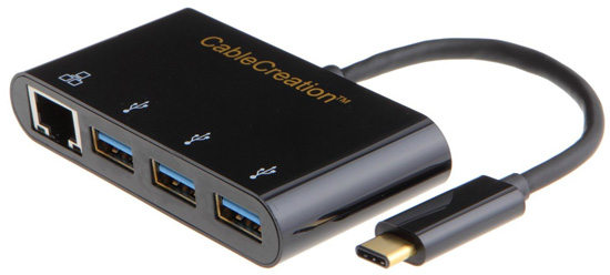
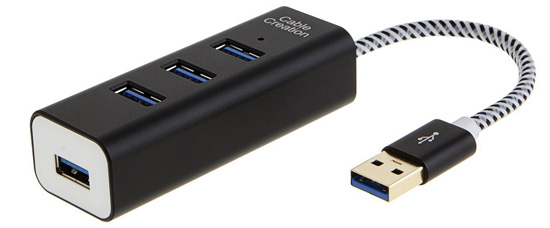
CableCreation 4-Port USB 3.0 Hub
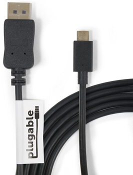
Plugable USB-C to DisplayPort Adapter Cable (this is the only cable I found that carries a 4k signal to my monitor at 60Hz)
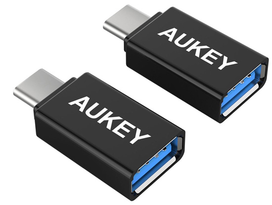
AUKEY USB-C to USB 3.0 Adapter (these are handy on the road or if you don’t want to haul around your other adapters and hubs)
That Touch bar
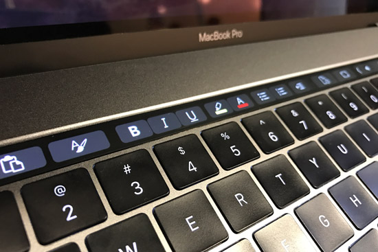
What was both the most interesting and confounding feature of this new generation is the Touch Bar. It’s a small touchscreen – about ½” tall and 10 ½” wide – that replaces the row of Function keys and provides contextual “buttons” based on the application you’re using. As of this writing, it feels like a solution in search of a problem. I haven’t really incorporated it into my daily work. While it can be nice if you are scrubbing audio or video, I’ve found my old habits of just reaching for the mouse or dragging my finger on the trackpad are hard to break. It does make for an interesting demo though.
However, I’m hopeful that more software vendors will make use of this feature and perhaps begin changing how we think about interacting with our computers. I do like how Microsoft recently added Touch Bar support to their Office apps. This lends some credibility to the feature and perhaps sets a trend for more creative implementations down the road.
What I have found useful is the fingerprint reader / power button to the right of the Touch Bar. Now I rarely use my password to unlock my machine or make purchases on the App Store. This is probably the single most useful feature Apple added this time around.
Battery Life
Not long after its release, the 2016 MacBook Pro was hit with a Cannot Recommend from Consumer Reports due to its poor battery performance. While I haven’t conducted any comprehensive testing, I have not yet been disappointed with the battery stamina of this machine. Most of my day is spent with it plugged in so I haven’t been in many situations where economy is even needed. Remember, I’m still fresh off a desktop tank, so my ability to leave my desk for an hour is still a treat. While there may be a day when I grump and grumble about not getting 10 hours of mobile use, I’m not there yet.
But I have run into one oddity. One day I was writing away from my desk and noticed a rapid decrease in the battery – losing almost 20% in 30 minutes. This didn’t seem right since I was just using Word, and had only Outlook and OneNote open in the background.
I run iStat Menus to give me a snapshot of various up-to-the-second info about my machine, including which GPU is active. I opened it and saw that the power-hungry Radeon 460 was running instead of the more efficient integrated Intel HD Graphics 530. I figured there had to be something wrong with the Automatic graphics switching. A quick online search failed to find any instances of this happening to others.
I popped open the Activity Monitor app and noticed that the Compressor Helper process (which gets installed with Apple’s Compressor app) was still running. I tried to kill it but it just kept running. I tried rebooting. Still nothing. Just for kicks, I launched Compressor and then quit it (hoping that would knock something loose). The process went away and the machine reverted to using Intel graphics. As of this writing I still have not found what is starting this process in the first place. I haven’t used Compressor for several weeks but see it about every other time I unplug from my 4k monitor. Not a deal breaker; just a nuisance I must stay on top of.
Touchy Keyboard
Apple can’t even escape controversy with their keyboards. This model features the second-generation butterfly design, with short-travel keys that are very light to the touch. I must admit that I like it, but it is taking some getting used to.
The keys are so light that if you rest your fingers too heavily it, keystrokes will be registered. If you’re trying to type while on the road, it doesn’t take much of a bump for you to end up with a few extra characters on screen.
These light keys were a challenge at first for me because I didn’t want to rest my wrists on the gigantic track pad (I can hear my keyboarding teacher now: “Wrists up!”). This meant my fingers were putting more downward pressure, so I adjusted and often felt I was typing like Johnny from the film “Airplane”.

Once I learned to trust the palm detection (which hasn’t let me down yet), I returned to being a lazy typist.
Overall
Moving from a Windows desktop tower to a portable Mac environment did require some adjustment in terms of workflow (file management craziness I won’t bore you with here), but I feel it was worth it. The freedom to move around more to work in different places and have all my files in the same place when working from home have made life easier.
Do I wish I didn’t need so many adapters? Sure, but I have trusted Apple for over 12 years and I can honestly say their radical changes never hurt me for long.
Like I said at the beginning, I’m not making an argument that this machine is the best fit for everyone. I’m sure I could have found a more powerful machine that wouldn’t have cost as much, but I prefer the Apple experience.


