Two Months of Mobile UX: Just Don’t
I’ve been on the road for about a month and a half now traveling Europe. My 15-inch MacBook is many things, but light is not one of them. It remained at home and I’m on the road with an Android phone and an older model iPad. Traveling this way has helped me see with maddening clarity the failures of modern web design. Though my problems include hardware issues and frequently terrible WiFi connections, I rage at the bad mobile design practices that I’ve encountered because I know they are preventable.
First some notes on hardware. My iPad is old enough that when typing a long paragraph, I can stop tapping and continue to watch the letters appear one by one. My phone is a Galaxy S4, with limited memory, battery life, and speed. The hardware I have now will likely be replaced before my next big trip. However, for now it’s what I’ve got.
Time and time again I’ve found that hostel, airport, and train WiFi leaves much to be desired. It’s slow, the connection is spotty, and the passwords are handwritten strings like g5631kS5I. (Can you tell the difference between a European’s S and 5, or 1, I, or l? Me either. These passwords drastically sacrifice usability for security.)
Connection and hardware problems on their own would be annoying, but these problems also exacerbate web design flaws. Mobile designers and developers, take note! Here are some of the most common problems I’ve encountered:
Feature Incompleteness
Many companies force their users to use an app or a special, mobile-only version of their site when they’re on a small screen. This could help increase security or give designers more control over the UI, but it can leave users out in the cold. I’d rather have to zoom and scroll to be able to digitally send a check to a friend who paid for a room, than to simply tell them, “Sorry, I’ll get to that in the next few weeks. ¯\_(ツ)_/¯ Mobile is hard.” (My struggles with digital wallets is another story entirely.)
Excessive Page Load Times
I’m looking at you, AirBnB. I want to be able to start typing my destination and desired dates right away on AirBnB.com. Instead, I wait up to a minute or more for the page to load over the slow connection, with the text input field frequently jumping around as more content loads. Don’t even think about trying to start typing before all the behind-the-scenes work is done – it just makes it worse. A quick check in the Chrome Developer Console shows the AirBnB site makes 88 requests on page load, bringing in 344 KB of data. When logged in, my Facebook timeline only requires 313 KB. Don’t try to tell me that autocompleting a location name and displaying some (should-be) static content really requires more JS than everything I can do from Facebook. I’m not the first one who noticed this – Rahul Gupta of Omaha Code School suggested this as further reading on what could be going on.
Accidental Taps Destroy Progress
In order to challenge a credit card charge, there are many pages of radio buttons to select and explanations to type. Under ideal circumstances, this shouldn’t take more than five minutes. On my iPad, I spent hours trying before giving up and waiting another week until I could use a friend’s laptop. In the meantime, I had a double charge of several hundred dollars that I really wanted reversed. Every time I would get reasonably far in the process, I would inevitably bump the wrong spot on the screen or lose my connection and return to the start, losing all my hard work. Long processes like this or pages with heavy user input should always have an “Are you sure?” button on navigating away with unsaved work, or better yet, save drafts.
App Download Requests
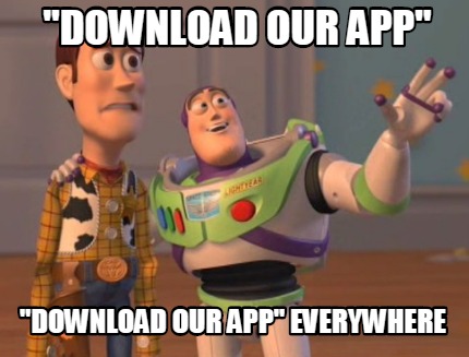
No, AirBnB (and Hostelworld and Hotels.com and airlines and TripAdvisor, and any other site that’s basically not a social network or for finances), I’m not going to download your app. Half the space on my phone is filled with Samsung bloatware, so I’m sorry, but there is no room for you. Please stop asking.
No Support for Chrome on iOS
I admittedly don’t use my iPad much while at home, so I had never been forced to use Safari in lieu of Chrome. However, I was prompted to switch browsers two or three times on this trip. In at least one of the instances I was trying to log in to a website using Facebook authentication, and was shown a message from Facebook about the error. Googling the message yielded a years-old Stack Overflow question, answered with workarounds. Thorough browser testing on mobile should catch this kind of issue.
Hopefully hearing some of my struggles to be a fully-connected nerd while on the road will help you design a better mobile experiences for your users. You can even simulate slow connections from your desk, so there’s really no excuse for the state of the mobile web to be as bad as it is. As for me, I’m ready to trade in my tablet for a netbook for travel. Many users really do prefer mobile devices, though. Don’t make them suffer for it!
Photo credit: Blake Patterson via Flickr cc


